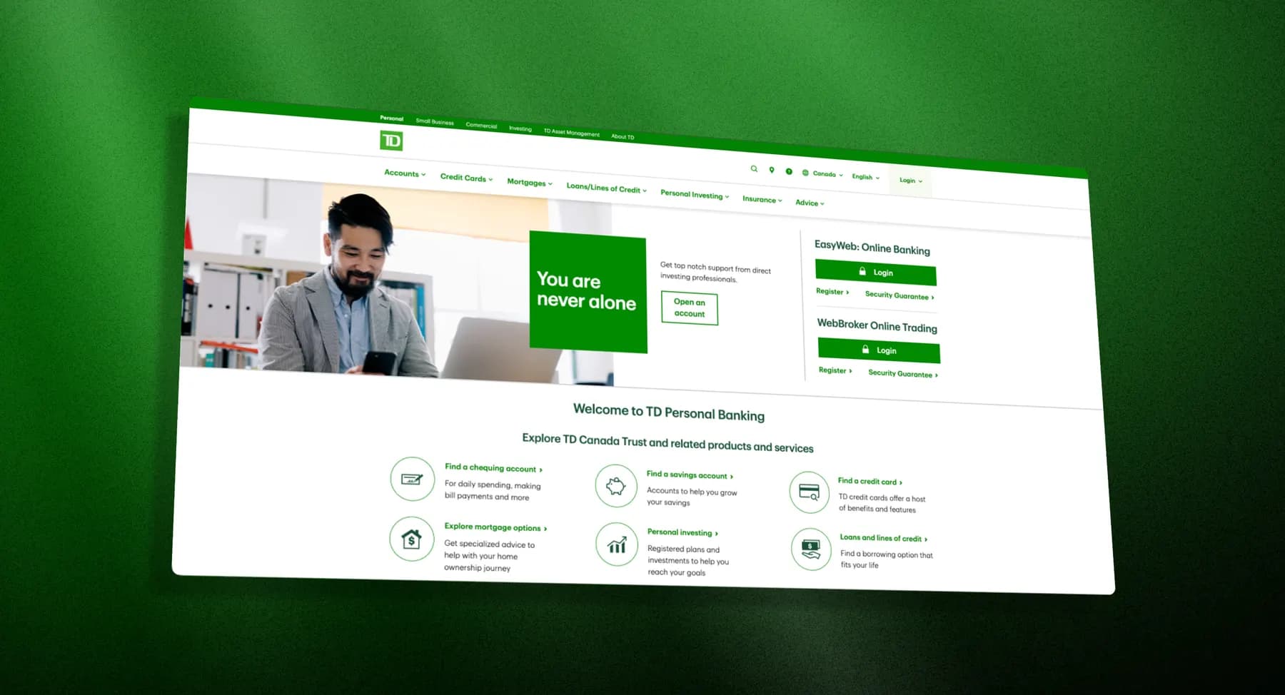
At a glance
At TD, I worked on an internal SDK used by product teams. The work sat between frontend implementation and the TD Design System: reusable components, predictable states, accessibility, and designer review.
Work
Built and refined reusable React components for internal product teams.
Collaboration
Worked with designers to translate design-system guidance into component APIs and states.
Lesson
Reusable UI needs good defaults, clear states, and enough flexibility for real product screens.
Context
A shared library for TD product teams
The TD Innersource Library helped internal teams ship common UI patterns without rebuilding them from scratch. My role was frontend implementation, working alongside designers connected to the TD Design System.
Work
I helped turn design guidance into reusable components
Components
Built and refined React components intended for repeated use across teams.
States
Covered default, hover, focus, disabled, loading, validation, and error behaviour.
Accessibility
Kept keyboard behaviour and accessible defaults inside the component contract.
Design review
Worked through edge cases with designers: long content, missing values, and product-specific usage.
Lesson
Component libraries are product infrastructure
The useful part of a component library is not the component folder. It is the set of decisions the library saves other teams from remaking: spacing, states, accessibility, interaction behaviour, and visual consistency.
This work gave me an early appreciation for frontend systems that have to survive outside the ideal mockup.